Summary
For this project I was responsible for designing a native app for iOS & Android, as well as a web app. I was the only designer on this project so I was involved in everything from helping the client with planning all the way to delivering final designs ready for development.
Core Responsibilities
- Conducted user research to understand requirements for new features
- Organized brainstorming sessions with team members to figure out best solutions to the problems at hand
- Created rough sketches of UI to gather feedback from team
- Iterated based on feedback and created wireframes and mockups for features and additions to the product
- Conducted user testing to validate designs.
- Worked very closely with engineering team throughout the process and also I was involved in implementation of the designs
Position
Design Lead
Timeline
May 2020 -
March 2021
Team
3 Developers, 1 Jr. Designer, 1 PM
While we are all staying at home as much as possible during the pandemic, we still need to fulfill our basic needs. Many people still require medications or need to get medical support for something other than COVID.
The main goal of the project was to improve experience for the doctors by providing a solution-based aproach through services offered, using the Design Thinking Process
Saving Times:
Allows doctors to save time by enabling remote consultation, reducing the tasks, increasing flexibility and focusing more on providing core to patients.
Convenience:
Provides convenience for doctors by enabling virtual consultation, improved patient outcomes and digital medical records management.
Earning Transparency:
Provides earning transparency for doctors by tracking all of the income & expenses statistic helping them to understand their complete financial insights.
Final Solution
To provide better healthcare access in this difficult times, I created application with combination of many importand features that we thought would be needed. Thes features will enable users to book appointments with health experts, to get prescribed medications, to talk with the doctors via chat, voice or video call.
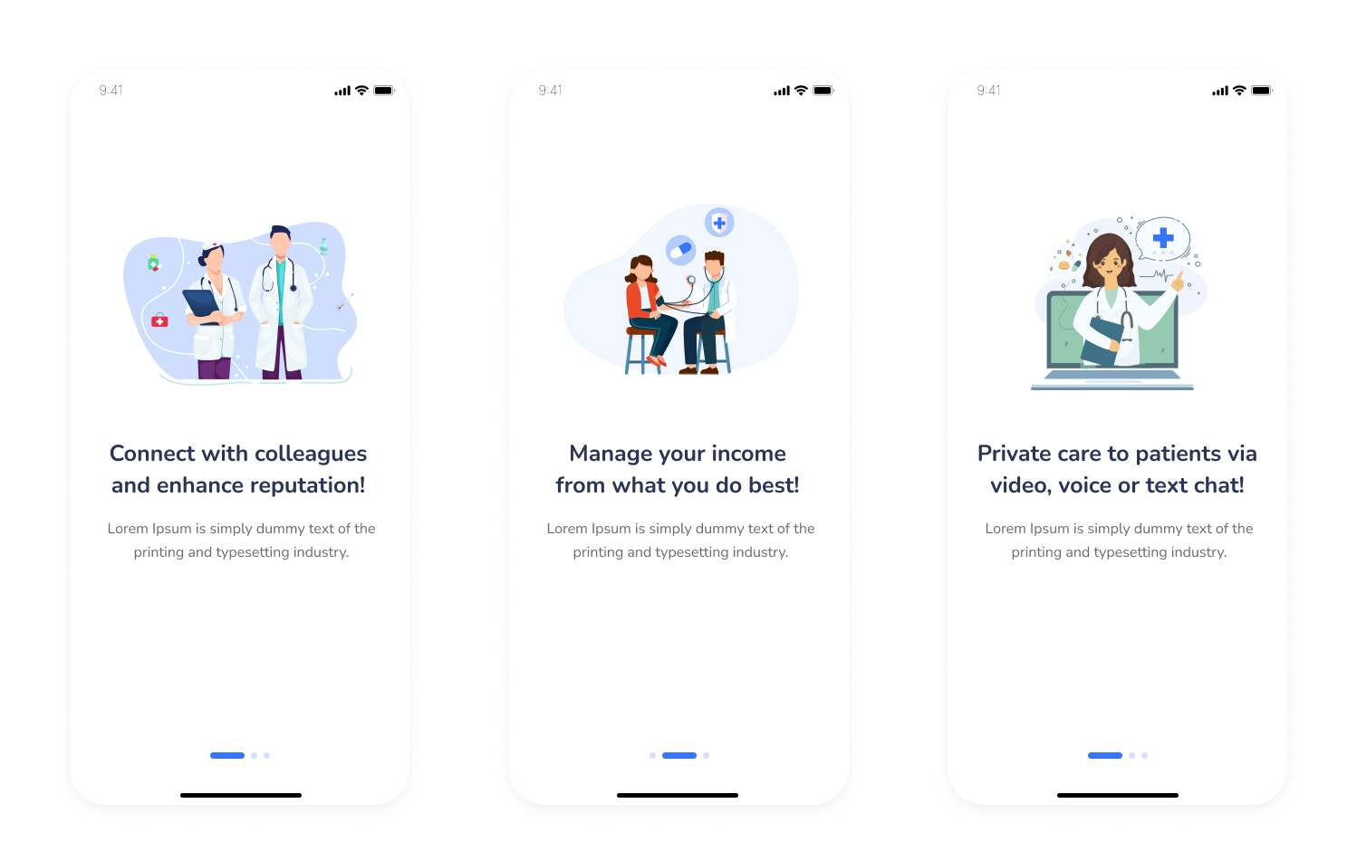
Final Design: Onboarding Screens
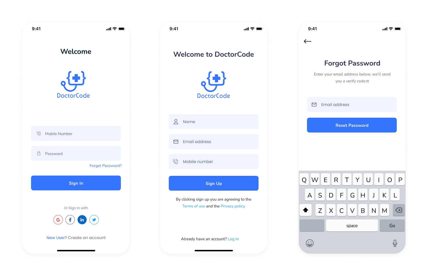
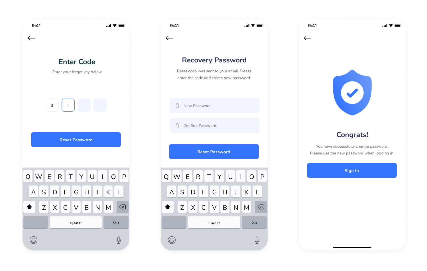
Final Design: Login Screens
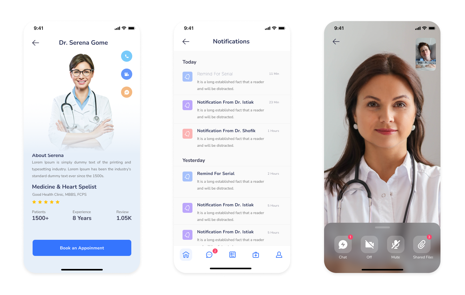
Final Design: Doctor Profile / Notification and Call Screens
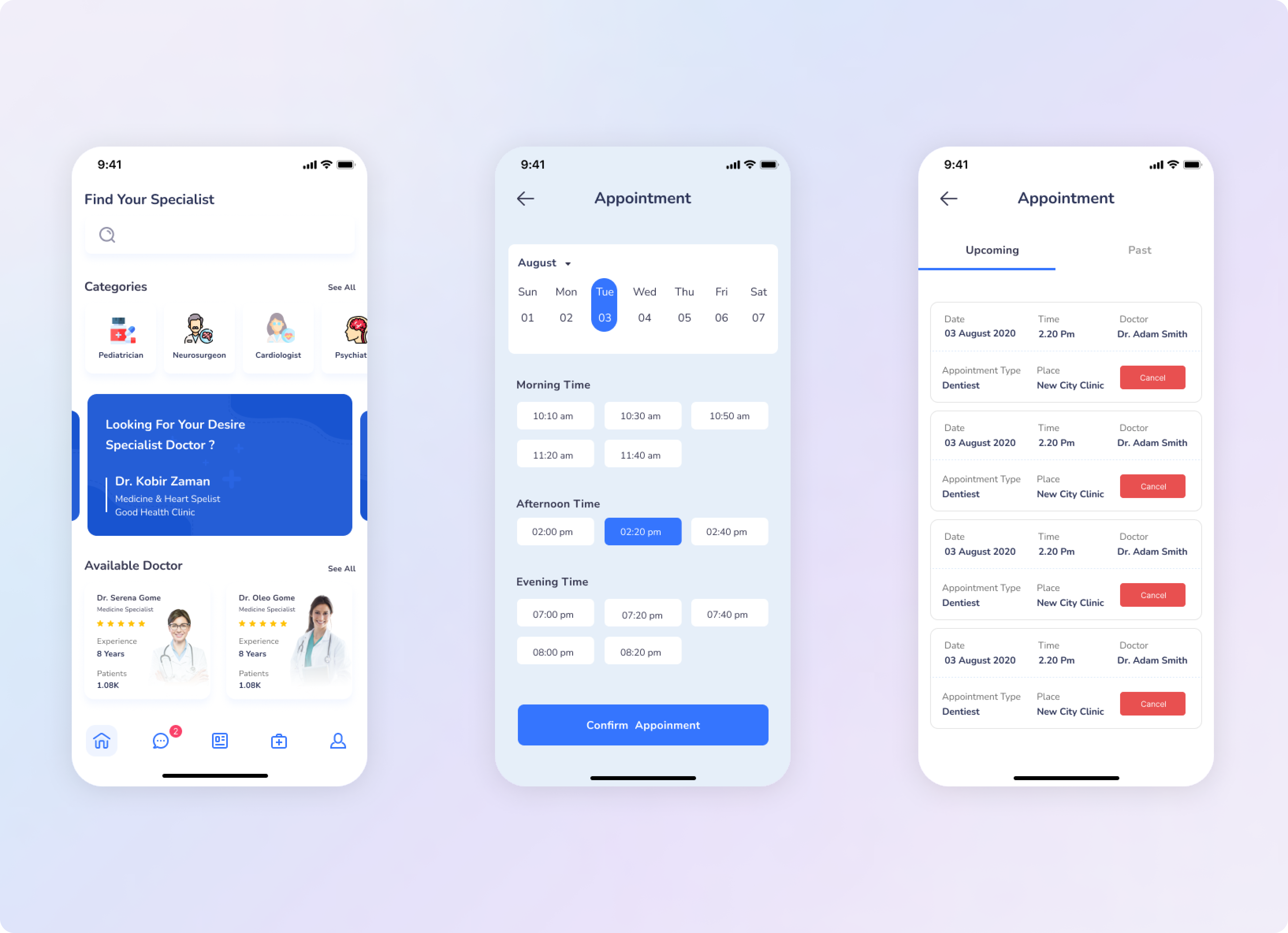
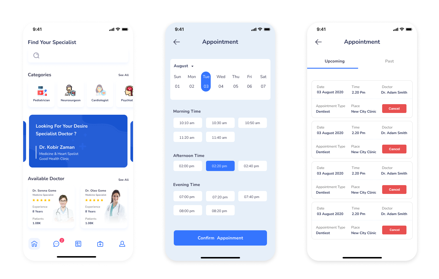
Final Design: Find your Specialist / Book an Appointment / Appointments lists
Unveiling Insights: Navigating User Realities for Enhanced Solutions
1. Enhanced User Experience:
By aligning the app with updated business processes and introducing new features, the project resulted in a significantly improved user experience. Users now find the platform more user-friendly, efficient, and visually appealing, leading to increased engagement and satisfaction.
2. No More Design Chaos:
We used to have this design mess - different styles, fonts, you name it. But now, we've got a solid design system in place. Everything looks consistent and professional. It's like we got our act together!
3. User Engagement and Growth:
After all the hard work, we saw a huge boost in user engagement. From our humble invite-only beginnings, we've grown into a bustling community of 400 paying members. It's pretty clear that our redesign and user-focused approach really paid off.
The process we followed
We wanted to show the team at Manypixels how facilitated workshops, followed by focussed prototyping and testing, could deliver not only the measurable results that they were looking for, but also a shared understanding between team members about what we were trying to achieve and what the users of the product essentially wanted to get out of their experiences.
Step 1 - Discovery
Understand the problems, the goals and the plan of action.
Step 2 - Conceptualise
Create wireframes and a clickable prototype of our concept.
Step 3 - Test
Give our prototype to users, gain insights into their
behaviour
and opinions.
Step 4 - Analysis
Take what we learned and use it to learn, improve and strategise.
Discover & Conceptualise
To understand the market and competitors and to also get a big picture of how DoctorPoint should position itself against competitors, I carried out an analysis of two similar apps. This provided insights about each competitor's strenghts, weaknessess, opportunities and threats..
User Interviews
Interviews helped me understand the problem space as well as potentional customers of DoctorPoint. I had to understand their mental models, pain points, needs and goals, sugestions and challanges. I categorized the findings into common themes.
Interview Insights
- The participiants dislike waiting long in line for an appointment
- The participiants want an app where their health records and data are kept safe from external malware.
- The app should be add free to avoid user frustration.
- They often search on internet to find health tips and solutions.
- They don't mind paying for online consultations.
- They want the online consultation fee to be as affordable as the usual consultation.
- One participient would rather not pay privately becouse they pay theis monthly health insurance.
- App should include articles with healthtips.
- App should include online pharmacy.
- App should include variaty of doctors.
- Conslultation fee should be paid by the health insurance.
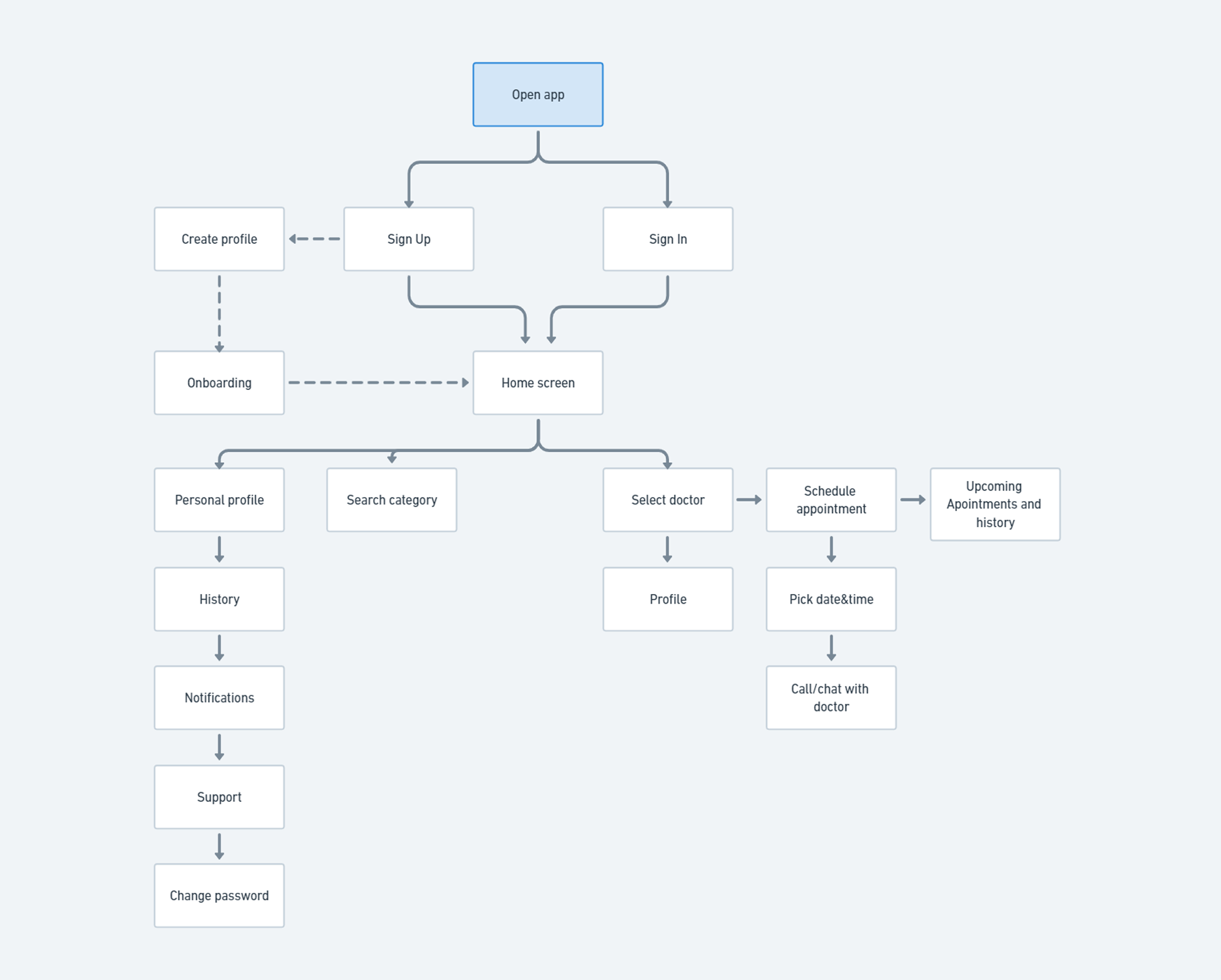
User Flow
At this point, the project had become well grounded. I had thorough understanding about its core features, structure and functionality. The goal of this stage was to orginize and structure all the content from the research phase. I created a basic flow of each step on the path of the user.
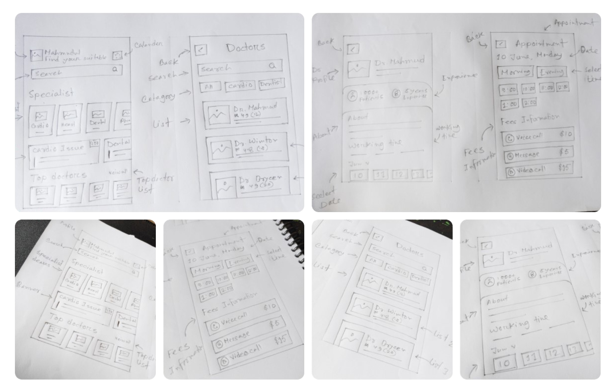
Wireframing & Prototyping
Using the structure of the the user flow, we draw out sketches of the app's main features firstly on paper. The main features like the flow to book a doctor appointment. After I was done with low-fid wireframes I went a bit further by creating mid-fid wireframes.
Final thoughts & takeaways
When I look back at our project, one big lesson stands out - putting our users first was the key to our success. By really getting what our users needed and giving it to them, we not only got more engagement but also saw our community grow to a whopping 400 paying members. Having a solid design system in place was also a game-changer, making sure everything looked pro and consistent. But at the end of the day, it was all about making our users happy by solving their problems and creating an app that's super easy to use. That's what set us up for more success down the road.