Summary
As the Lead UX/UI Designer for HealthIndex, I was the sole designer responsible for the entire project. I designed the app from scratch, focusing on creating seamless user experiences and a fresh brand identity. I defined the UI kit, ensuring consistency across the app, and developed detailed mockups and interactive prototypes to visualize the design.
I collaborated closely with developers, working side by side to bring the design to life and address any challenges promptly. My goal was to create an intuitive, user-friendly app that bridges the gap between healthcare practitioners and patients, reducing wait times and enhancing the overall appointment booking experience.
Core Responsibilities
- Led the design direction of HealthIndex.
- Enhanced the user experience for key features.
- Created visual and interactive elements in Figma and Adobe XD.
- Ensured accessibility and performance standards.
- Conducted user research and interviews.
- Designed unique visuals like illustrations and icons.
- Collaborated closely with the development team.
Position
Sr. UI/UX Designer
Timeline
August 2023 - May 2024
Team
2 Developers, 1 PO, 1 QA Engeneer
Forging a Path to Clarity: Elevating Communication and UI for a Superior Platform
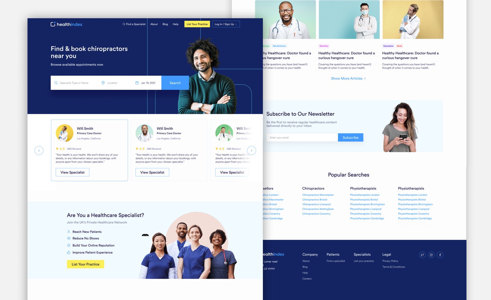
Final Design: Main Dashboard
Test the Prototype:
This case study is still under construction, but if you want to learn more about the project in detail, reach out and let's chat!