My role
My primary responsibility was to create intuitive and visually appealing interfaces that enhance the user experience. This involved understanding user needs, conducting research, and designing interfaces that are easy to navigate. I collaborated closely with developers and product managers to ensure effective implementation of the designs.
Additionally, I iterated on designs based on feedback and testing to continuously improve the user experience. My goal was to create interfaces that are both aesthetically pleasing and user-friendly, ultimately leading to increased user satisfaction and engagement.
Key Achievements
- Increased conversions across all product listing pages by 19.8%
- Improved usability of filters across web, iOS, and Android platforms
- Enhanced content discoverability on product category pages
Summary
At DevelopMe+, the UI was 20 years old, and the UX role had been unfilled for years. As a Senior UI/UX Designer, I led the transformation of the platform, implementing a modern UI and improving the UX with new flows and functionalities.
Tackling Manager-User Disconnect and UI Inconsistencies
We faced numerous user problems due to the chaotic system state, making issues hard to identify. The best solution was to start from scratch.
Key problems included:
- Manager-User Communication: Admins needed quick and easy access to the service, but communication between managers and users was extremely poor. Managers lacked information about team members' learning histories, making it difficult to determine course relevance.
- UI Inconsistencies:The user interface was inconsistent and outdated. To address this, I created a new, fresh style guide for the project, which I continuously updated.
From Outdated UI to a Seamless User Experience
The goal of this UX project was to transform the outdated learning management system (DevelopMe+) into a user-friendly platform with a modern UI and improved UX. The project aimed to address several key challenges:
Enhance Admin Access and Communication
Make it easy for users, administrators, managers, and learners, to efficiently access learning requirements, follow learning paths, and manage their learning history.
Improve User Efficiency
Facilitate quick and easy access for administrators, enabling them to effectively communicate and manage learning requirements for users.
UI Consistency
Create a visually appealing and consistent user interface by developing and implementing a new style guide to replace the outdated and inconsistent UI.
Accessibility and Inclusivity
Ensure the platform complies with accessibility standards (e.g., WCAG) and track improvements in accessibility scores.
Forging a Path to Clarity: Elevating Communication and UI for a Superior Platform
Finally, after a couple weeks of iterations, we landed on a style that we were comfortable with. We thought that users can now access a dedicated tool within DevelopMe+ to seamlessly view, manage, and complete their learning-related tasks. In our initial MVP release, we've introduced features that empower users to efficiently handle both individual learning tasks and navigate the open enrollment process across the entire platform.
Final Design: Main Dashboard
Before
The main dashboard was cluttered and disjointed, making navigation difficult and obscuring team members' learning histories. The lack of visual hierarchy and inconsistent UI elements created a confusing and uninviting user experience, hindering engagement and communication.
After
Users can now access a consolidated management dashboard within DevelopMe+ that I've designed. This dashboard empowers users to conveniently oversee their learning progress, efficiently manage their tasks, and access all necessary information in one centralized location, simplifying their learning experience.

Profile page
Before
Cluttered interface tracking numerous communication types

After
Detailed preview of profile pages with intuitive design and enhanced usability, enabling easy access to relevant information and seamless navigation.
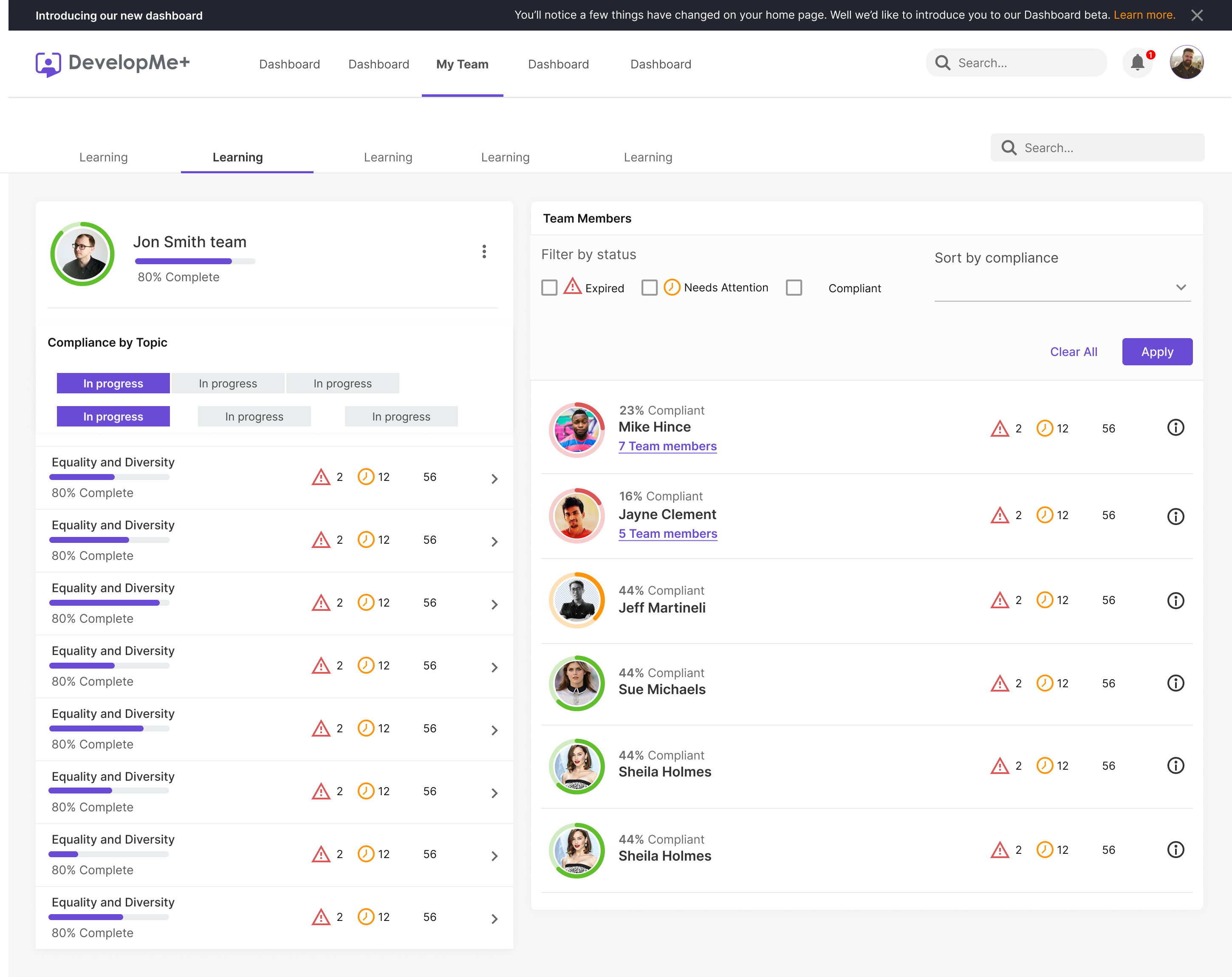
Final Design: Team view
Users can now access a dedicated profile management tool within DevelopMe+. In our initial MVP release, we've introduced features that enable users to view, manage, and update their personal profiles, as well as easily navigate through the learning requirements and follow learning paths across the entire platform.
Final Design: Assesment course details
Users can easily access their desired courses from the dashboard, this time with a specific focus on assessment courses. By simply clicking on the course card, they can navigate to view comprehensive details, initiate the assessment, and ultimately review their assessment results—all within a seamless and user-friendly process.
Outcomes
1. Improved User Experience:
The project achieved a streamlined and intuitive user experience, making it easier for users to access learning materials and manage their progress efficiently.
2. Enhanced Admin Efficiency:
Admins can now access and communicate information more effectively, facilitating better decision-making regarding course relevance for team members.
3. Modernized UI and Consistency:
The project introduced a modern, visually appealing user interface with a consistent design language, enhancing the platform's overall professionalism and usability.
Unveiling Insights: Navigating User Realities for Enhanced Solutions
Me and PM conducted a series of interviews to better understand the problem this project was attepting to solve. My questions centered on understanding the user goals, the contents of use and what is their top priority focus..
Research Objectives
The intention of the interviews was to see how the users handle the old app on dialy basis.
- Assess whether the terminology is understood by users and appropriate language is used
- Determine whether the process flows in a logical way
- Assess if users can effectively navigate through the process using the links and buttons
- Assess whether the content adequately supports users
- Analysis of how the design measures up against user goals, business goals, project intent, and system or technical constraints
Analyzing Data
With all of our data collected from the research and analyzing the feedback from the focused group, we created an affinity map of our findings. The affinity map helped us organize our thoughts and really find the most important problem

Unveiling Insights: Navigating User Realities for Enhanced Solutions
To prioritize features with the most immediate impact, I collaborated with the Product Manager, engineering, and product operations to strategize an MVP release plan. We collectively opted to focus on two core workflows central to the majority of user interactions within DevelopMe+: managing user tasks and optimizing the open enrollment process.

Unveiling Insights: Navigating User Realities for Enhanced Solutions
Once we knew what problem to solve, we focused on coming up with as many ideas to solve it. We went for quantity over quality and welcomed absurd ideas.
Firstly our focus was on home page/Dashboard. We were aiming to brought most important informations our users uses on daily and weekly basis, combine and compiled all into one place.

Navigating towards personalized progress insights and enhanced adoption
We tested the low-fi wireframes with couple of our loyal users. We guided them through the flow and gethered very useful feedback.
After this usability testing we created mid-fidelity wireframes, we added some more functionality and more visibility and clarity with the UI. And we condinued improving the the layout with Round 2 Usability tesing this phase.
The user testing took place with a group of new PWA customers that had just signed up for an in-person course. The insights gathered from this study were really positive but threw up a suprising observation for 2 out of the 5 test-subjects.
Feedback summary:
- 5 out of the 5 testers would almost certainly pay for supplementary training that could be undertaken in preparation of an in-person course.
- 3 out of the 5 testers said that they would take an online course instead of an in person course if it were available.
- 2 out of the 5 testers said that they prefer consultation with line manager before start some online training.
Final thoughts & takeaways
Reflecting on this UX project, we placed users front and center, resulting in a smoother user experience within DevelopMe+. Effective communication between managers and users was a game-changer. Providing administrators quick access to information empowered them. Maintaining a modern, consistent interface was key for user-friendliness. This project emphasized that UX design is an ongoing journey, transforming the learning system. Our efforts drove impressive results: 133% growth and a YoY revenue increase of 124% from 2020 to 2021.